Make Your Yearbook More Diverse
& Inclusive with These Easy Tips
Our yearbook staff’s motto is “Everybody’s Story. Everybody’s Book.” That means everyone! Not just the seniors, the athletes, the staffers and their friends, certain cliques – everybody. Why does that matter? For one, if we are creating a book for people to purchase, they need to be reflected in it; or they won’t purchase it. But the bigger, more important reason is simply that we are telling the story of a year, and without every person represented, considered, and included in the yearbook design, we haven’t done our job: We haven’t told the true story of the year at all if we let bias or favoritism creep in or if we get lazy with coverage and choices. The yearbook must be an accurate time capsule with reflections of each person’s interests, styles, talents, abilities, and backgrounds. Therefore, you can make your yearbook more diverse and inclusive with these easy steps! Tips for your yearbook pages and beyond.
SELECT ACCESSIBLE FONTS FOR AN INCLUSIVE YEARBOOK
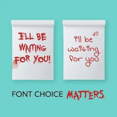
There are more font choices than I want to count from my publisher alone, which doesn’t even include any other fonts from any other website you could choose. The good news (or bad depending on your point of view), you don’t need them all. We typically choose three fonts: one for headlines, one for subheadlines, and one for body copy and captions. The first two are more creative and the last is a simple san serif or serif. We also try never to take our body copy or captions less than size 8, and we really strive for no lower than a 10-point font size. That simple choice helps the book have consistency, but it also helps students with visual impairments or processing disabilities be able to read and enjoy as well. Fonts help tell the story as much as pictures and words, so choosing the right ones is essential. If your font choices are too wild or don’t convey the right tone, you risk losing the intended meaning. If your font choices are inconsistent or just downright hard to read, you risk losing your audience. We’ve all seen the funny memes with fonts that are way too spooky for the occasion; just because a font is available doesn’t mean you have to use it! Selecting the right fonts allows everyone to enjoy the book and feel included.
DESIGN CLEAN PAGES FOR AN INCLUSIVE YEARBOOK
Along with the idea of easy-to-read fonts are clean, clutter-free pages. Many students and adults (think families) experience over-stimulation when pages are cluttered and busy. Take time to plan pages with intentional layouts with white space, adequately sized images, and muted (or consistent, at the very least) color schemes. Again, we choose one color family and stick to only a few colors from the family in that grouping. You can also do pulled color (color from the images themselves), and that helps the pages look “pulled together” and prevents it from seeming like you chose colors “out of nowhere.”
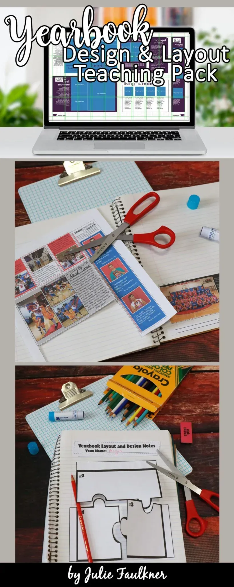
Many publishing companies provide templates with preplanned layouts that are clean and seamless that you can use throughout your book to bring it together. And that saves you time! Even though your pages are designed by multiple staffers, the last thing you want regarding design is for it to look like those people weren’t “on the same page” when it comes to design. Readers with or without attention disorders would become fatigued with a book full of chaotic pages and may give up, so spend time designing simple pages so everyone can enjoy them. You can check out my Yearbook Layouts and Design Teaching Pack here.
REPRESENT ALL THE FACES FOR A DIVERSE AND INCLUSIVE YEARBOOK
Another policy we have is that we cover every student three times in the book. Over the years our student body count has fluctuated from 650-450, and our book page count has fluctuated from 218-180. While these numbers may or may not be similar to your school, I still highly recommend covering students authentically at least 3 times each. You can read my blog post here about coverage to get more ideas on how to cover authentically, but if students don’t see themselves in the yearbook, they won’t feel like it’s their book.
REPRESENT ALL THE LANGUAGES FOR A DIVERSE AND INCLUSIVE YEARBOOK
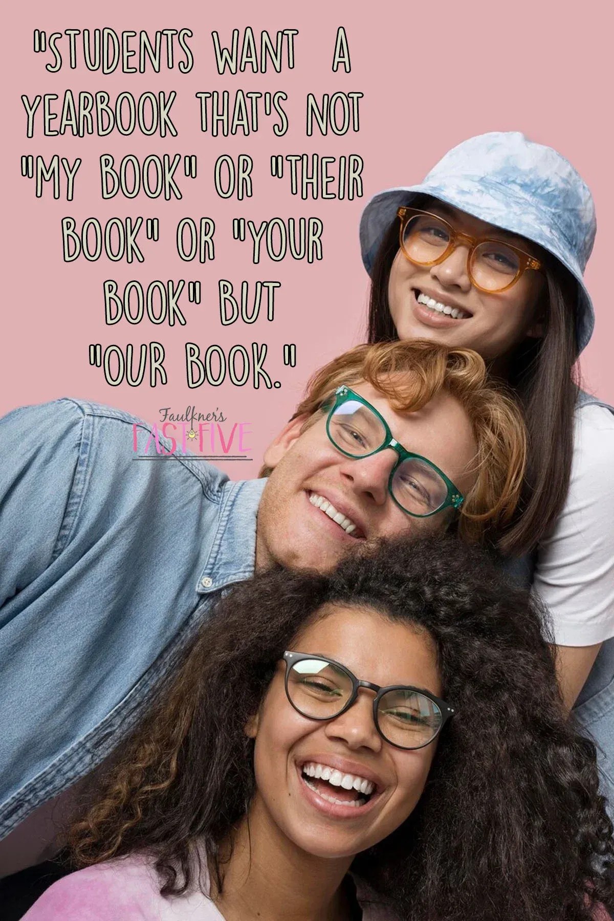
While it may not be possible to provide every caption, story, or headline in multiple languages, the languages your student body speaks should be included in the book as often as possible. Your counselor, ESL or ELL teachers, and language teachers will be able to provide you with a list of languages and even help with accurate translations. Many publishers now offer extensions with QR codes where you can provide differing languages or even audio readings. Along with languages, remember to include and represent the various cultures and backgrounds that are present in your school. This may mean not only changing which athlete you select for the dominant photo, but also the type of content, sidebars, and spreads your design. Stephen Covey said, “Strength lies in differences, not in similarities.” Imagine the strength of a book that includes and celebrates all the differences yet presents them in a way that feels whole — the whole of a year — a yearbook that’s not “my book” or “their book” or “your book” BUT “OUR BOOK.”
SET AN APPROACHABLE PRICE POINT
This tip strays from the content-focused ideas found above, so it is something you might not really think about as you plan. However, your price point should be playing a pretty significant role in the page ladder/content. Think about the economic diversity of your student body. My school is a Title 1 school, which means many families are middle to low when it comes to yearly income. I can’t afford to produce a large, expensive book with “all the frills.” That doesn’t mean that we produce a plain or standard book; we certainly don’t. What we do, though, is make careful, thoughtful choices along the way that put our book’s price at a point that more students and families can afford. For example, we select a page count that gets done exactly what we need – each sport is featured, we have nice-sized portraits, a creative calendar, clubs, and plenty of collages. In other words, we make the most of every page. We don’t go over the top with the cover design, but we are intentional in selecting finishes and add-ons.
The other thing we do to help with cost is sell business and senior tribute ads. It is a lot of extra work, and it does affect the ladder. However, it is worth it to offset the cost for our students. Check out my business advertisements teaching pack and tools if you need some direction in that area. Lastly, we offer a program called “Adopt-a-Senior,” which invites the community or business owners to make a donation toward the cost of a book, so that our seniors in need get a book gifted to them.
In conclusion, an inclusive and diverse yearbook does more than just check a box. It boosts school spirit, creates relationships, builds bridges, and sets an example for everyone. Students are part of a community – a family of sorts – for the time they are in school and really forever. It’s the yearbook that seals up those forever memories; it’s our job to make sure those memories are documented not just aesthetically, but accurately and adequately as well.
READY TO GET YOUR YEARBOOK CLASS OFF TO A GREAT START? CHECK OUT THIS RELATED POST: 5 WAYS TO HAVE A PICTURE PERFECT START TO YOUR YEAR.
Love this content?
Sign up for my email newsletter with more tips, ideas, success stories, and freebies!